Obsidian Supply
Intro
Obsidian Supply approached us to define a brand rooted in durability and restraint. The goal was a visual identity that feels strong, minimal, and intentional.
Client
Obsidian Supply Co.
Year
2024
Duration
6 Weeks
Brand Identity
Art Direction
Services
Overview
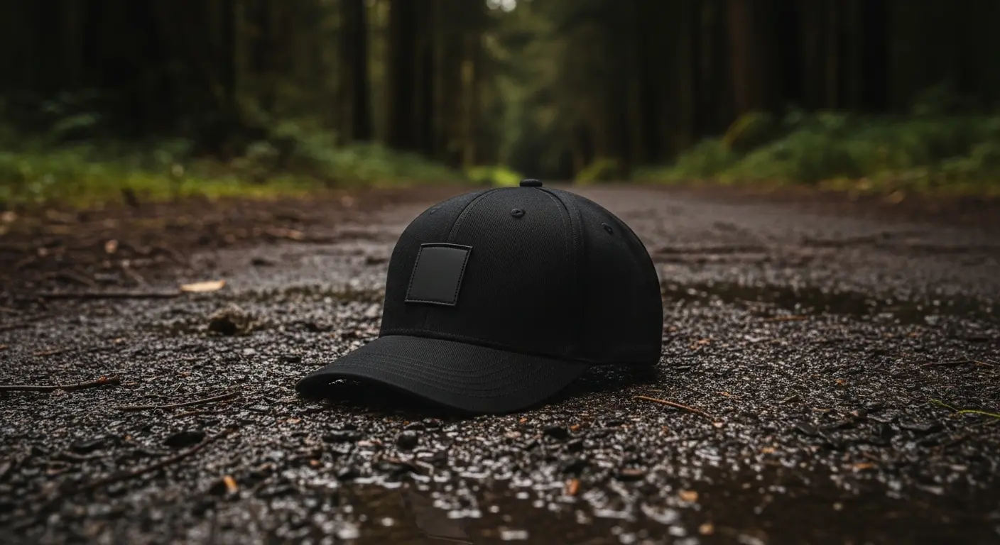
The project focused on building a minimal yet powerful identity for a performance-driven apparel brand. Inspired by raw materials and extreme environments, the visual direction leans into contrast, texture, and controlled intensity.
Challenge
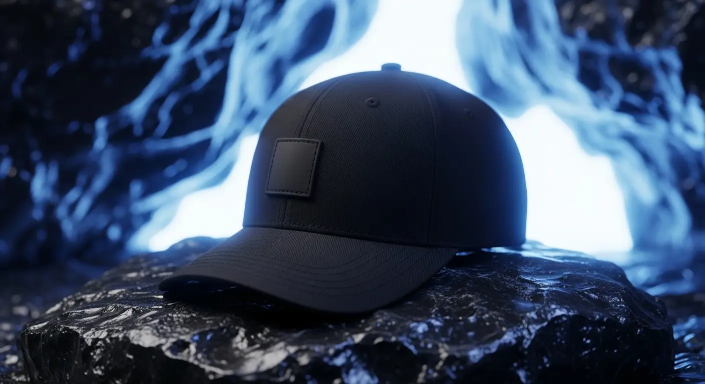
The main challenge was avoiding the typical aggressive aesthetic often associated with performance brands. Instead of loud visuals, the identity needed to feel confident and restrained while still carrying a strong presence.
Approach
We developed a system centered around reduction and material influence. Dark tonal palettes, subtle detailing, and sharp geometry formed the foundation. Art direction emphasized contrast between refined products and harsh, elemental environments.

Outcome
The result is a cohesive identity that feels both premium and resilient. The brand stands out through its restraint, delivering a clear and recognizable presence across all touchpoints without relying on noise or excess.
Let's work
Ready to build
something
iconic?
Obsidian Supply
Intro
Obsidian Supply approached us to define a brand rooted in durability and restraint. The goal was a visual identity that feels strong, minimal, and intentional.
Client
Obsidian Supply Co.
Year
2024
Duration
6 Weeks
Brand Identity
Art Direction
Services
Overview
The project focused on building a minimal yet powerful identity for a performance-driven apparel brand. Inspired by raw materials and extreme environments, the visual direction leans into contrast, texture, and controlled intensity.
Challenge
The main challenge was avoiding the typical aggressive aesthetic often associated with performance brands. Instead of loud visuals, the identity needed to feel confident and restrained while still carrying a strong presence.
Approach
We developed a system centered around reduction and material influence. Dark tonal palettes, subtle detailing, and sharp geometry formed the foundation. Art direction emphasized contrast between refined products and harsh, elemental environments.
Outcome
The result is a cohesive identity that feels both premium and resilient. The brand stands out through its restraint, delivering a clear and recognizable presence across all touchpoints without relying on noise or excess.
Let's work
Ready to build
something
iconic?
Obsidian Supply
Intro
Obsidian Supply approached us to define a brand rooted in durability and restraint. The goal was a visual identity that feels strong, minimal, and intentional.
Client
Obsidian Supply Co.
Year
2024
Duration
6 Weeks
Brand Identity
Art Direction
Services
Overview
The project focused on building a minimal yet powerful identity for a performance-driven apparel brand. Inspired by raw materials and extreme environments, the visual direction leans into contrast, texture, and controlled intensity.
Challenge
The main challenge was avoiding the typical aggressive aesthetic often associated with performance brands. Instead of loud visuals, the identity needed to feel confident and restrained while still carrying a strong presence.
Approach
We developed a system centered around reduction and material influence. Dark tonal palettes, subtle detailing, and sharp geometry formed the foundation. Art direction emphasized contrast between refined products and harsh, elemental environments.
Outcome
The result is a cohesive identity that feels both premium and resilient. The brand stands out through its restraint, delivering a clear and recognizable presence across all touchpoints without relying on noise or excess.
Let's work